10th August 2010
BACK
TO WEATHER-BLOG MENU
New!
Fine Art Prints & digital images for sale-
Welsh Weather
& Dyfi Valley landscapes Slide-Library - Click HERE
|
"RUNAWAY" WARMING - BACK
TO THE HOTHOUSE? Commentators
sometimes refer to "runaway
global warming". My take on that is that it does not refer to our
climate ending up like that of Venus - a very hot, lifeless place where
the surface temperature is over 400C and surface water is nonexistent.
That such a scenario appears unlikely is a case of "so far, so good",
though. Let's see what's possible instead. To
see what unmitigated warming could
"run away" to, we need to look at temperatures and atmospheric
composition through the 542 million years (reference 1 at the end of
this page) of the Phanerozoic Eon that we live in - from the Cambrian
Period to the present day. Now, of course, one cannot simply
travel back through time to directly sample the air and take the
temperature in the Jurassic Period, for example. But through
painstaking research into palaeoecology - looking at how
ecosystems have changed in the past through examination of the fossil
record, and by looking at variations in the chemical composition of
fossilised
material, we can gain a good understanding of what conditions were like
in the past. We see ancient ice-ages coming and going because not only
do they leave behind highly distinctive deposits such as glacial
moraine but also, because of the widespread transition of liquid water
to ice and back as ice-caps develop and then melt, we see global
sea-levels falling (regression) and then rising (transgression), the
processes marked by the types of sedimentary rocks that were deposited
at the time and faunas that were fossilised within them.
In
the upper part, the red and black
dashed lines are corrected temperatures and the yellow envelope the
field of error - the amount of uncertainty. Next
down is carbon dioxide - the solid
black line - with the pinkish envelope again being the field of error.
The fact that the latter gets bigger and bigger the further one goes
back in
time bears testimony to the difficulty in getting good data from older
and older rocks. The
blue bars represent ice-ages, which
are so geologically un-subtle that their presence even way back in the
past is relatively easy to detect. We see the recent one at the far
right and another major one around 300 million years ago in late
Carboniferous and early Permian times. Firstly,
a word on carbon dioxide. Note
the steep fall on the LHS of the diagram, from 450 to 350 million years
ago. The fossil record shows that during this time, vascular land
plants - first appearing about 425 million years ago - underwent a
major evolutionary radiation and became widespread. By the beginning,
359 million years ago, of the Carboniferous Period, so named because of
the numerous coal deposits that were formed in its tropical swamps,
plantlife was abundant. No surprise then that, through this part of the
Phanerozoic, carbon dioxide levels fell due to its increasingly
important uptake by photosynthesis. Next,
let's consider what the
temperature data show, which is that during the Phanerozoic, global
temperatures have risen and fallen above and below the present-day
average figure of approximately 14C, within a range of 7C above to 2C
below. At times,
carbon dioxide levels during warmer periods have been 1000ppm or more,
but warming seems to have stopped beyond the +7C point. That in turn
suggests that once temperatures warm to that
point, one or more natural mechanisms kick in to cap off the rise.
That's good to know! At
the same time, however, the reconstruction shows the predominance of
warmer
global conditions over the past 250 million years and again for much of
the time prior to the Permo-Carboniferous glaciation. These warmer
conditions are referred to as the "Hothouse" climate whilst the colder
interludes are referred to as the "Icehouse" climate. During
Hothouse conditions, polar
icecaps are typically absent although the narrower, lighter blue bars
in the diagram indicate that at times they were able to form on a
temporary
basis in terms of geological time. During Icehouse conditions, glaciers
and ice-caps were more widespread and not just restricted to
the poles. So,
what could a return to Hothouse
mean? When we cooled out of the last one, about 34 million years ago,
we left behind a time when carbon
dioxide levels were around, or even in excess of, 1000ppm and global
temperatures were 2-3C higher than those of the present day - something
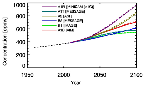
that we could manage to bring about ourselves within 90 years if we
keep burning fossil
fuels - as the IPCC graph below (reference 3 at end of page) shows.
Scenario A1F1 is a continuation of current-day high emissions.
A
geologically-rapid
transition to Hothouse over a million years would be one thing:
one over several centuries would be extremely difficult
to manage. The droughts, wildfires and crop damage seen in Russia of
late are just part of the problem. Another major one is the unavoidable
threat to infrastructure
situated on low-lying land as Earth's geography takes on a key feature
of the Hothouse climate: no polar ice-caps, resulting over several
centuries in tens of metres of sea-level rise. Alex
Tingle's online sea-level rise plotter (reference 4 at end of page) is
a useful basic guide to how the process will reshape global geography.
A 1:25,000 O.S. map and a pencil to trace the relevant contours will
also do if you prefer the manual version. I
say basic because as Alex says it does not take into account issues
such as tidal variations, coastal erosion and so on - factors likely to
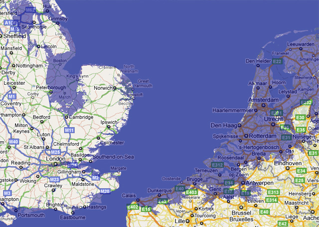
increase the reshaping of coastlines. The screengrab below shows how
Eastern England, NW France, Belgium and Holland will appear with ten
metres of sea-level rise, the amount that would likely happen if the
Greenland and West Antarctica ice-sheets melted:
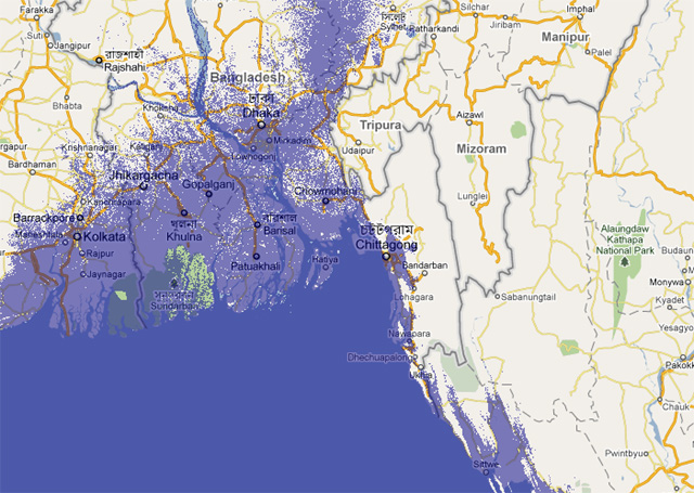
At
the same scale, this is Bangladesh.
158 million people currently live here:
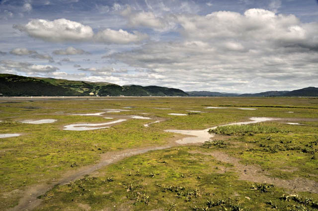
I
took this last Sunday afternoon when I
wandered out across the salt-marshes to the sandy mud-flats of the
intertidal zone of the Dyfi Estuary. The flat expanse, gullied in
places by winding creeks as they make their way down to the main river
channel, is a striking sight specifically for that flatness. In the
distance on either side, hills fall steeply to the abrupt change to
flat sandy mud. It looks as though a once-deeper valley has been
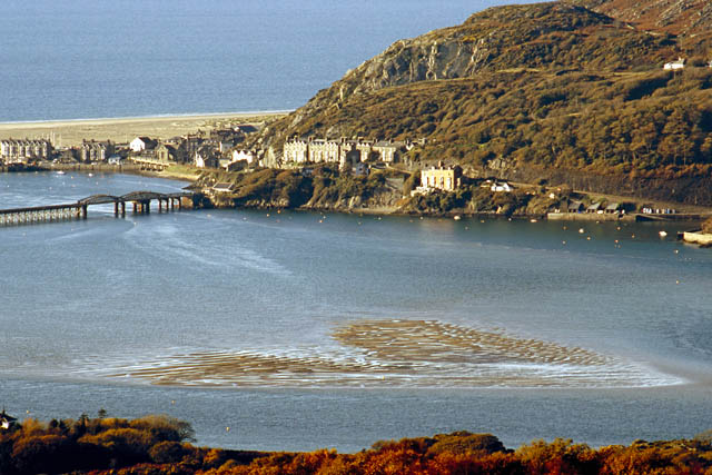
filled-in by sediment. What has happened? The photo below shows the Mawddach Estuary and Barmouth, the next major estuary to my north, where, and I quote the British Geological Survey, "In the Mawddach Estuary superficial [soft sediment - JM] deposits have been proved to 23m in boreholes and geophysical evidence suggests that there are three adjacent channels varying in depth between 24 and 43m. In order to cut such deep channels subaerially, Blundell, King and Wilson (1964) estimated that the sea levels must have stood some 90m below present O.D." (reference 5 at end of page) That's
right -
between 24 and 43m beneath the sandbars in this photo you get to the
bedrock floor of the valley itself. A similar figure likely applies to
the Dyfi Estuary: geophysical evidence mentioned in the Aberystwyth
District Geological Survey Memoir again implies a distance of tens of
metres down to bedrock in places. These valleys - just two of many
examples - have indeed been filled-in by sediment. How did that happen?
As
sea-levels rose, several things
occurred. Firstly, the sea advanced and the coastline, which would
initially have been miles further out to the west, retreated inland.
Secondly, deep valleys like these would have been flooded. The rivers
flowing down them would have become sluggish and then tidal. Thirdly,
sediment - mud and sand-sized particles, washed down from the eroding
hills by the river and brought in by the tides from the sea, would have
then been able to accumulate, layer upon layer. And so as the sea rose,
step-by-step the valley filled with sediment to eventually result in
the familiar scenes in the two photos above. NASA
have
a useful page detailing the rate of sea-level rise as the last
glaciation ended and the transition to modern conditions got underway
(see reference 6 at end of the page). I quote: "Massive
ice sheets covered parts of North America, northern Europe, and several
other regions during the last ice age. This huge volume of ice lowered
global sea level by around 120 meters as compared to today. After the
ice sheets began to melt and retreat, sea level rose rapidly, with
several periods of even faster spurts..... A more clearly-defined
accelerated phase of sea level rise occurred between 14,600 to 13,500
years before present (termed "meltwater pulse 1A" or "MWP-1A" by
Fairbanks in 1989), when sea level increased by some 16 to 24 m." That
IS
fast: it works out at 1.4 to 2.1 cm per year! Over
the
whole melting period, from the last glacial maximum 18,000 years
ago to the point, about 5000 years ago, when the situation stabilised,
the average rate of rise - 120m over 13,000 years - works out at
9
millimetres per year. The current rate, which has steadily increased
since the 1960s, is between 3 and 4mm per year (see reference 7 at end
of the page). In
an
interesting paper published in 2009 entitled "Global sea level
linked to global temperature", by
Some politically-minded
people complain that climate science is nothing but a tax-raising
"scam". But it does not take a genius to figure out that the loss of
our low-lying coastal lands and communities would be a tax beyond
imagination. 1.
See https://engineering.purdue.edu/Stratigraphy/gssp/ 2.
Royer et al., 2004. CO2 as a primary
driver of Phanerozoic climate. GSA Today; v. 14; no. 3, doi:
10.1130/1052-5173 3.
See http://www.ipcc-data.org/ddc_co2.html 4.
See http://flood.firetree.net/ 5. Allen, P.M., and Jackson, A.A. 1985. Geology of the country around Harlech. Memoirs of the British Geological Survey. Explanation of sheet 135, with part of 149, 112pp. 6.
See
http://www.giss.nasa.gov/research/briefs/gornitz_09/ 6.
See
http://www.pik-potsdam.de/~stefan/Publications/Journals/vermeer_rahmstorf_2009.pdf |
BACK TO WEATHER-BLOG MENU New! Fine Art Prints & digital images for sale- Welsh Weather & Dyfi Valley landscapes Slide-Library - Click HERE |
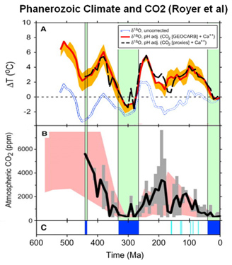 This diagram
shows what we know to date on the matter of palaeotemperatures and
carbon dioxide levels. See reference 2 at the end of this page for the
original data source.